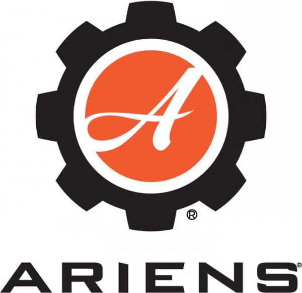
The Ariens Co. launched a new logo for the Ariens brand of power equipment. The new brand mark blends the company’s history with a new, modern look.
The Ariens gear is part of the brand mark making history and legacy the forefront of the brand conversation. While the gear stands for where the company has been, the redesigned Ariens font is bold, crisp and prominent. The new look is modern, yet timeless, and represents the company’s future of innovation and advancement.
“The logo marks the beginning of a new chapter of innovation that will carry our iconic brand into the future,” says Ariens Co. Chairman/CEO Dan Ariens. “We have an exciting few years ahead of us as we rebrand and introduce some new and innovative equipment to the marketplace.”
As part of the launch, Ariens introduced two variations of the logo
- a primary, vertically-stacked version
- a secondary, horizontally-aligned version.
As a result, the placement of the gear and the text is reminiscent of the Gravely logo format that was introduced in 2014.
“By aligning the overall look of the two logos, the brands are now more closely related from a visual standpoint. They are easily recognized as having the same parent company,” Ariens continues.
The new logo will initially appear on Ariens snow product starting this summer. Lawn and garden equipment will have the new logo beginning in fall 2016. The first look at the new lawn and garden lineup will take place at GIE+EXPO 2016 in Louisville, Ky.
Related Articles
